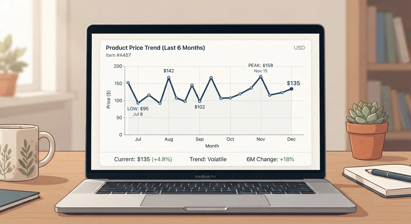
What a Price History Graph Actually Shows
A price history graph is a line chart that plots the recorded selling price of a product at regular intervals - typically daily - over a chosen time window. The horizontal axis represents time; the vertical axis represents price. Each point on the line is a real transaction or listed price captured at that moment.
Before you can read a chart effectively, it helps to understand a few key terms. The all-time low is the lowest price ever recorded for that item in the dataset. The 90-day average is the mean price over the past three months - a useful baseline for spotting whether today's price is above or below normal. Dynamic pricing refers to automated, algorithm-driven price changes that retailers apply in real time based on demand, competitor pricing, and inventory levels. For a plain-language breakdown of these and other terms, see the price comparison glossary maintained in this series.
Price history tools work by logging publicly visible prices at set intervals. They do not capture private or member-only pricing, and they can only track what was publicly listed - not what individual shoppers actually paid after coupons or account-level discounts.
How to Read the Peaks
A peak - a sharp upward spike or sustained high plateau - usually has one of four causes:
- New product launch: Manufacturers and retailers often price new items at a premium at release. The graph will show the item entering at a high price, then gradually declining.
- Inventory shortage: When supply tightens, prices rise. A sudden mid-year spike with no obvious seasonal reason is often a supply signal.
- High-demand period: Consumer electronics spike before major gift-giving holidays; outdoor furniture peaks in spring. These patterns repeat annually and are easy to identify on a multi-year chart.
- Inflated reference price: Some retailers briefly raise a price before applying a promotional discount, making the percentage-off figure appear larger. A sharp, short peak immediately before a stated sale is a red flag worth scrutinizing. The article on evaluating listed discounts covers this pattern in detail.
When you spot a peak, ask: does this align with a known season or event? If not, investigate before assuming the current lower price is a genuine saving.
Multi-Year Charts Reveal the Most
A 30-day chart may show a price that looks low relative to recent weeks but is actually elevated compared to the same time last year. Whenever a tool offers a one- or two-year view, use it to verify that a seasonal dip is genuinely a dip and not just a return to the standard price.
How to Read the Dips
Dips - points where the line drops noticeably below the surrounding baseline - are what most shoppers are looking for. But not every dip represents equal value.
- Shallow, frequent dips: If the price drops a small amount regularly (say, every few weeks), the item may be subject to routine promotional cycling. Waiting for one of these routine dips is usually a reliable strategy.
- Deep, infrequent dips: A price that drops sharply once or twice a year, then bounces back, signals a genuine periodic sale. These are worth planning around if the purchase is flexible.
- Sustained low periods: A price that stays low for weeks before rising again may reflect clearance of old stock ahead of a model update - a particularly common pattern in electronics and appliances.
The most useful number when evaluating a dip is how it compares to the 90-day average. If today's price is at or below that average, and the chart shows the item has not spent much time at this level, it represents a genuinely lower-than-typical price. This is the foundation of price benchmarking, which the complete price comparison guide addresses end to end.
Step-by-Step: Analyzing a Chart Before You Buy
Follow these steps each time you pull up a price history graph for any product.
Set the time window to at least 90 days
Most price history tools default to a 30-day view. Switch to 90 days or longer. A broader window reveals seasonal patterns and shows whether a current low is genuinely unusual or just the product's typical resting price.
Identify the all-time low and the 90-day average
Most tools display these figures automatically. Note both numbers. The all-time low tells you the floor the price has reached; the 90-day average tells you what is normal right now. Compare today's price against each.
Look for recurring seasonal peaks and dips
Scroll through the chart and note whether prices rise around the same time each year (major shopping seasons, spring/summer demand shifts) and whether they reliably dip in predictable off-peak windows. If a pattern exists, you can plan your purchase around it.
Check for artificial pre-sale spikes
Zoom in on the period immediately before any promoted sale or discount. If the price was raised briefly just before the sale started, the stated percentage discount is calculated from an inflated baseline - not a true saving relative to the normal price.
Assess price volatility before deciding when to act
If the chart shows that prices on this item move frequently and unpredictably, set a price alert at or slightly below the 90-day average rather than waiting for an unknown future dip. If the chart shows stable pricing with rare dips, patience is more likely to pay off.
Patterns That Indicate Dynamic Pricing
Some products - particularly those sold through large online marketplaces - show highly erratic price histories: the line jumps up and down by significant amounts with no clear seasonal pattern. This is a hallmark of algorithmic dynamic pricing, where the retailer's system adjusts prices automatically based on competitor data, browsing behavior signals, and inventory levels.
For these items, the 90-day average becomes even more important, since any single price point may not be representative. Checking the chart on multiple days before purchasing gives a clearer picture of the realistic price floor.
Dynamic pricing also applies in categories beyond consumer goods. If you are tracking vehicle prices, for instance, similar forces - inventory cycles, seasonal demand, and financing conditions - shape the numbers you see. The article on timing a car purchase explores how those forces work in an automotive context.
If you are new to the tools that generate these charts, this roadmap to price comparison tools explains how to get started and which features to prioritize.