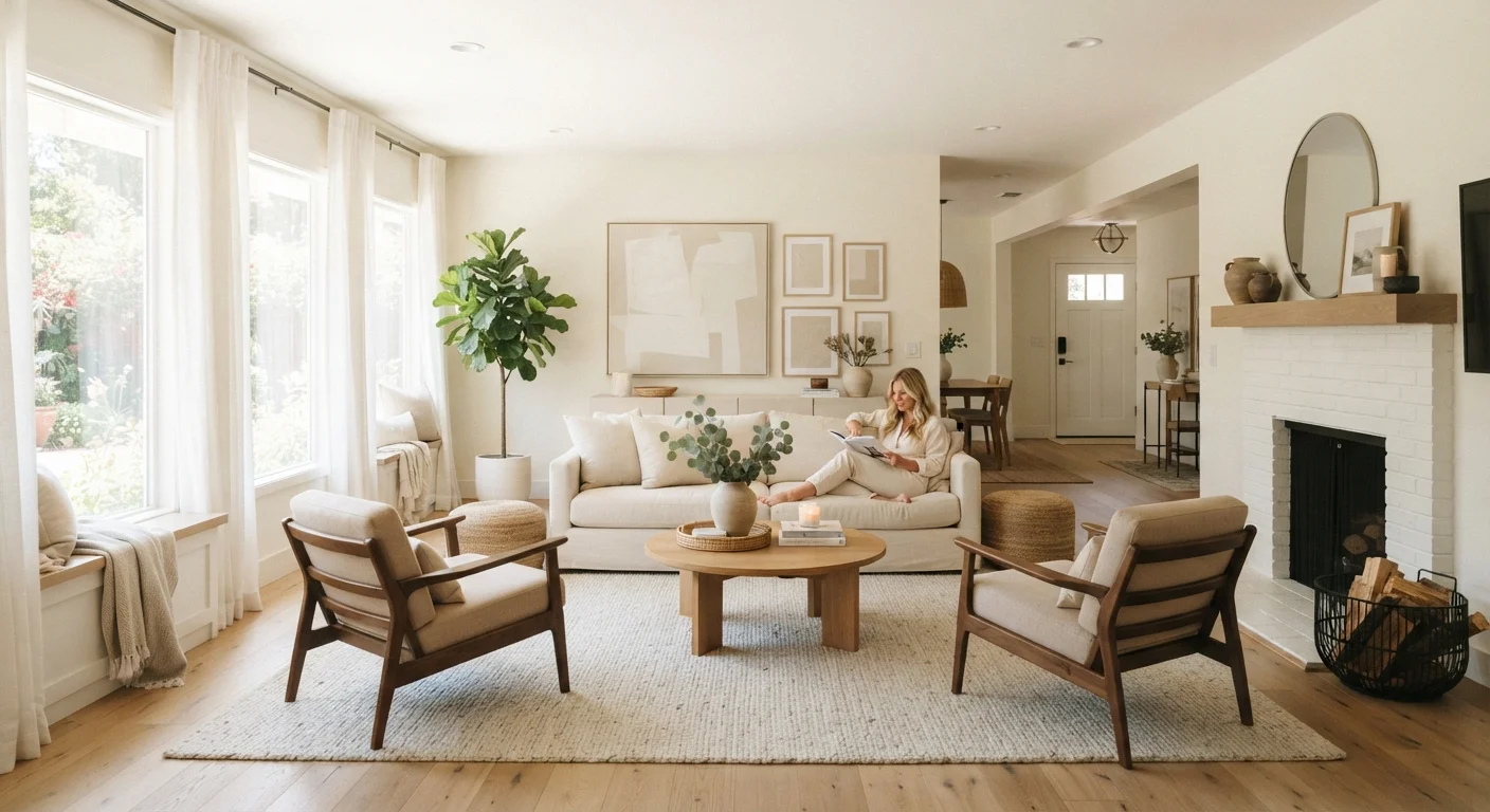
Why Design Vocabulary Matters for Homeowners
You don't need a design degree to create a room that feels pulled together - but knowing the vocabulary professionals use gives you a reliable framework for every decorating decision. Terms like scale, proportion, rhythm, and negative space aren't abstract theory. They're practical tools that explain why one arrangement feels restful and another feels cluttered.
When you can name what's working (or not), you can fix it deliberately rather than by trial and error. This reference guide defines the concepts designers return to most often, so you can apply them on any budget. Before diving into a room refresh, you may also find it useful to work through the pre-decorating planning checklist to set yourself up for success.
Scale
The size of an object relative to the room or to other objects around it. A piece is 'to scale' when its physical size feels appropriate for its surroundings - neither overwhelming the space nor disappearing into it.
Proportion
The size relationship between parts of a single object or between multiple objects. Good proportion means the visual weight of furnishings feels balanced - for example, a dining table and its chairs share a harmonious height and surface-area ratio.
Negative Space
The intentionally empty areas in a room - floor, wall, or surface left unoccupied. Far from wasted space, negative space allows the eye to rest and gives nearby objects more visual impact.
Rhythm
Visual repetition that guides the eye around a room. Rhythm can be created through repeated colors, shapes, patterns, or textures placed at intervals, giving a space a sense of order and flow.
Focal Point
The dominant visual element in a room that draws the eye first - commonly a fireplace, large window, piece of artwork, or statement furniture. Every well-designed room typically has one deliberate focal point.
Balance
The even distribution of visual weight in a room. Symmetrical balance mirrors objects on either side of a central axis; asymmetrical balance achieves equilibrium with different-sized objects of comparable visual weight.
Visual Weight
How heavy or dominant an object appears to the eye, influenced by its size, color, texture, and pattern. Dark colors and dense textures carry more visual weight than light, open, or minimally detailed surfaces.
Color Temperature
The perceived warmth or coolness of a color. Warm tones (reds, oranges, yellows) tend to feel energizing and advance toward the viewer; cool tones (blues, greens, grays) tend to feel calming and recede.
Layering
Building depth in a room by combining multiple textures, materials, and elements at different levels - rugs on floors, textiles on furniture, art on walls - to create richness without clutter.
Contrast
The deliberate pairing of opposing elements - light and dark, rough and smooth, large and small - to create visual interest and help individual elements stand out.
The Core Concepts at a Glance
Use the quick reference below as a starting point, then read the definitions in the glossary for fuller explanations of each term.
| Scale | Object size relative to the room |
| Proportion | Size relationships between objects |
| Negative Space | Intentionally empty areas |
| Rhythm | Repeated visual elements that guide the eye |
| Focal Point | The dominant visual element in a room |
| Visual Weight | How heavy an object appears to the eye |
| Color Temperature | Perceived warmth or coolness of a color |
| Layering | Combining textures at different levels for depth |
One of the most common misunderstandings involves scale - many homeowners assume a small room demands small furniture, when in reality an undersized sofa can make a modest space feel more cramped, not less. For a deeper look at how design myths like this one can cost you money and satisfaction, see common decorating myths debunked.
Putting the Concepts to Work in a Real Room
Abstract definitions become intuitive when you apply them together. Consider a small bedroom: proportion guides you to choose a bed frame whose visual weight suits the room's size; rhythm is created by repeating a bedside lamp on both sides of the headboard; negative space is preserved by resisting the urge to fill every corner. The result feels calm rather than crowded.
For a room-specific walkthrough, our guide on styling a small bedroom shows how layout principles and visual tricks translate these concepts into practical decisions without requiring a large budget.
Broader home improvement projects benefit from the same foundational thinking. Whether you're updating a kitchen or refreshing an entryway, the home improvement resource hub offers practical guidance on upgrading spaces at any price point. The goal is always the same: deliberate choices that serve both function and visual comfort.
This article is for general informational and educational purposes. Design outcomes depend on many variables including room dimensions, lighting conditions, and personal preference. Results will vary.