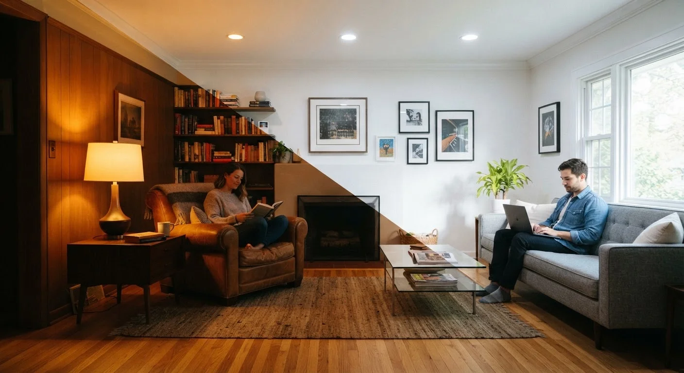
Why Colour Temperature Is More Than a Lighting Spec
Most people choose paint colours based on how they look in a store sample under fluorescent retail lighting - then wonder why the colour looks completely different once it's on the wall at home. The culprit is almost always colour temperature: the quality of light (both artificial and natural) that acts as an invisible filter over every surface, fabric, and finish in a room.
Understanding colour temperature is one of the foundational skills in interior design. As explained in our guide on core interior design concepts, perception of colour, scale, and mood are deeply intertwined - and light is the variable that ties them together.
Colour temperature affects rooms in two distinct but related ways: through the bulbs and fixtures that illuminate the space, and through the inherent undertones in paint, textiles, and materials. Both work simultaneously, either reinforcing each other or creating visual tension.
~2700K
Kelvin rating of a standard incandescent bulb
This warm amber output has long been the residential benchmark, which is why LED replacements are often tuned to match it for familiar home ambience.
5500-6500K
Colour temperature of open sky daylight
This cool-blue spectrum is used as a reference point for colour-accurate work environments including design studios and photography spaces.
Up to 30%
Difference in perceived room size under varying lighting
Interior design research suggests lighting intensity and colour temperature can significantly alter spatial perception, independent of physical room dimensions.
Warm Light: Comfort, Intimacy, and the Amber Effect
Light sources below 3000K emit a yellowish-orange glow that mimics candlelight or early morning sun. In residential settings, this range is commonly labelled 'soft white' or 'warm white' on bulb packaging. The effect on a room is immediate: shadows soften, contrast reduces, and the space feels sheltered rather than exposed.
Warm lighting tends to flatten detail and compress space visually. This makes it ideal for bedrooms, dining areas, and living rooms where relaxation is the goal - but less suitable for kitchens or bathrooms where colour accuracy and task clarity matter. A warm-lit bathroom, for example, can make it harder to judge makeup application or spot cleaning areas that need attention.
On the paint side, warm undertones in neutrals - creamy whites, greige, terracotta, and ochre - reinforce the amber effect. Under warm lighting, these tones deepen and intensify. Under cool lighting, they can appear muddy or orange. This is why a paint colour that reads as a sophisticated warm neutral in a showroom can feel garish in a home with different lighting.
Cool Light: Clarity, Focus, and the Perception of Space
As colour temperature rises above 4000K - into the range labelled 'cool white' or 'daylight' - light becomes progressively more blue-white. This is closer to overcast midday daylight, which the human visual system associates with alertness and clarity.
Cool lighting enhances colour accuracy and reveals surface detail, making it practical for kitchens, workshops, and home offices. It also tends to make rooms feel larger and more open - an effect decorators sometimes leverage deliberately in small or low-ceilinged spaces. However, used without balance, cool light can feel clinical or harsh in rooms designed for rest.
Paint undertones in the cool family - blues, greens, grey-violets, and stark whites - respond well to cooler light sources. These colours can look elegant and precise under daylight-spectrum bulbs but can shift toward a cold or unwelcoming tone when placed under overly warm incandescent light. If your room still feels unsettled after decorating, lighting temperature is often overlooked as a cause - see our piece on why decorated rooms still feel off for a fuller look at these interactions.
How Natural Light Complicates Everything
Natural daylight is not a fixed quantity. It shifts from around 2000K at sunrise and sunset (a deep amber) to approximately 6500K on a bright overcast day. This means a north-facing room receives consistently cool, diffuse light that can make warm paint tones appear grey, while a west-facing room is flooded with golden evening warmth that transforms the same colours entirely.
Understanding your room's orientation is therefore a prerequisite for any decorating decision. If you're planning a full room refresh, working through a pre-decoration checklist that includes a lighting assessment can prevent costly mistakes.
The practical takeaway: always test paint swatches on the actual wall, and observe them at multiple times of day - morning, midday, and evening - before committing. A colour that looks balanced at noon may look dramatically different by 7 pm under your artificial lighting layer.
“Light is not simply something that allows us to see a room - it is the primary material of which a room is made. Change the light, and you change the room entirely.”
— Paraphrase of a widely held principle in architectural lighting design, Foundational principle in environmental psychology and interior design practice
Putting It Together: Making Colour Temperature Work for Your Room
The goal in most rooms is not to pick a single colour temperature and apply it uniformly, but to layer sources intentionally. A common approach used by designers is to anchor a room with a warm ambient light (ceiling fixture or floor lamps at 2700K-3000K) and introduce cooler task lighting where needed - a reading lamp, under-cabinet kitchen lights, or a desk fixture at 4000K.
Paint selection should follow the same logic. Choose undertones that complement - not fight - your dominant light source. If your room is largely lit by warm bulbs, a paint with blue undertones may read purple or grey in the evening. If your space gets strong north-facing daylight, a warm white that looks creamy in the store may appear dingy rather than inviting. These are not myths - the evidence is clear that undertone-light interactions are among the most common decorating missteps homeowners make, a subject explored further in our look at common decorating myths.
Finally, don't underestimate the role of fixtures themselves. The physical placement, shade material, and direction of a light source all modify how colour temperature lands in a room. For deeper guidance on this, our article on lighting as a decorative layer covers how pendants, sconces, and floor lamps can be chosen for both function and mood.
Colour temperature isn't a technical detail to leave to electricians or paint-counter staff. It's one of the most accessible and cost-effective levers you have for shaping how a room feels - and understanding it puts you well ahead of most decorating decisions.